

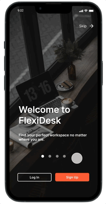
FlexiDesk
Helping remote workers find public workspaces via custom search results and crowd-sourced recommendations.
ROLE
UX Research, UI Design
DURATION
2 to 3 months
PLATFORM
iOS Mobile
INDUSTRY
Lifestyle
TOOLS
Figma, Google Forms, Maze
AREAS OF FOCUS
Research, Information Architecture, Mobile App Design
Overview
In today's evolving landscape of mobile and remote work, the search for a suitable work environment beyond traditional settings can prove challenging. As a design student, I recognized this common problem among remote workers and embarked on creating FlexiDesk, a mobile application that aims to provide a solution. Inspired by my personal experiences as a university student and freelancer, I set out to design an innovative solution that empowers users to effortlessly discover and access their ideal public workspaces.
* This case study presents a conceptual design, envisioned as part of a student project.
THE PROBLEM
Remote workers and students often face the challenge of locating public workspaces that cater to their individual needs, resulting in frustration and poor productivity.
Research + Analysis
To gain valuable insights and shape the development of FlexiDesk, I conducted an extensive research study involving 17 individuals aged between 20 and 35, who regularly rely on mobile devices to find suitable public workspaces.
Through a series of surveys and interviews, I delved into their search habits on mobile apps, uncovering their preferences and priorities. Moreover, I explored their motivations, frustrations, and recent remote working experiences, providing a comprehensive understanding of their needs and pain points.
Top 3 Apps Used
Google Maps
Yelp
Instagram
Top 3 Search Phrases
“Coffee shops”
“Coffee”
“Starbucks”
Top 3 Search Criteria
Free Wi-Fi
Access to electrical outlets
Cost of time/space
“I don’t really see enough [reviews] about, like… ‘Is it loud?’ People should mention the atmosphere. What I really want to know is… How much work can I actually get done there?”
— Remote worker + Part-time student, female
2 out of 4
interviewees seek non-cafés for a unique work experience
3 out of 4
interviewees prefer to work from a place that matches their personality
4 out of 4
interviewees always start their search on Google or Apple Maps
— Key Insights
My research ultimately pointed to these 3 priorities for remote workers…
💬 to know which places are available/suit their needs ahead of time
💬 an environment they feel productive in
💬 to identify with a location’s image + clientele
“I generally go to the same places… but if I’m feeling spicy, I may check out a new coffee shop. I typically do though, because that’s my vibe. I love trying out new things and seeing new places.”
— Part-time student, male
Defining the Design
Due to time and scope constraints, I solely focused on designing an experience for these 2 tasks:
Searching for a place nearby
Seeing filtered search results

Design + Prototype
— Mid-fidelity Design: Round 1
Key Features
✏️ Basic Navigation
Search & Filtering
Familiar functionality + UI with popular mobile navigation apps
✏️ Awareness at a Distance
Live update tags
Community-sourced information relevant only to remote working needs
✏️ Personalized Search Results
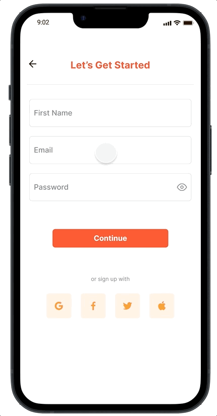
Sign up questionnaire to save users’ workspace and search preferences
Smart recommendations


— Usability Test
In order to validate and enhance the usability of FlexiDesk, I conducted usability testing with 8 individuals who belonged to the target user group, two of whom were interviewed during the initial phase of research.
Participants were asked to perform three tasks, then based on their feedback, I identified the following areas for improvement.
-
Create a search profile
Search for a nearby café to work from
Explore the home tab and review merchant details
-
Participants suggested providing more specific answer choices and clear interaction instructions on questionnaire pages to ensure a smooth user experience.
It was recommended to add additional context to the colored tags representing locations with live updates, enabling users to quickly understand the significance of the information.
Participants highlighted the importance of establishing a stronger connection between a user's search preferences and the details visible on location preview tiles, ensuring a seamless and personalized experience.
— High-fidelity Design: Round 2
Taking into account the user feedback collected, I made significant revisions to the design and prototype.
These were the final improvements:
✔️ Enhanced the user interface (UI) and refined the interaction instructions on the profile questionnaire, ensuring a more intuitive and user-friendly experience.
✔️ Reorganized the information displayed on location preview tiles, optimizing the layout to provide clearer and more relevant details at a glance.
✔️ Incorporated additional icons and visual markers to enhance scan-ability and make it easier for users to identify important information quickly.
✔️ Adjusted the order of content on the Home screen, giving priority to user preferences and ensuring that the most relevant and personalized options are prominently displayed.
✔️ Fine-tuned the micro-copy throughout the app, refining the language and messaging to ensure clarity and consistency.
Click here to explore these design revisions and experience the latest prototype.
